Design for Readers by Ed Henniger
Jumping inside
I am no fan of jumps. Anyone who has been to my workshops and/or followed my blog knows that.
The main reason why I don’t like jumps is that readers tell us time and again that they don’t like jumps. Some won’t even start a story that jumps.
If I owned your newspaper (don’t worry, no chance of that ever happening!), your last issue would be the last time you jumped a story. But, I’d have to show you how to direct your writers, write tighter and segment your stories. It wouldn’t be easy, but it would get done.

But I don’t own your newspaper (lucky you!) and I accept the reality that most newspapers will jump at least a couple of stories from page 1 and/or the sports front.
So, here are some suggestions to help you make jumps work better for readers:
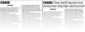
Write a jump head that makes sense. Just a word, like “Police” or “City” or “Chase”, doesn’t do the job. One-word jump heads assume that readers always read from front to back. Not true. Many will actually start at the opinion page or the sports front and then go forward. So a jump keyword with a “follow” headline (see illustration with this column) gives readers something that makes a bit more sense…and makes the jump more compelling to read.
Take all jumps to the same page. Readers can become frustrated when you take them to page 4 with one jump, page 7 with another and page 9 with still another. Designate one page as the jumps page and make sure it has enough space to handle all jumps — with visuals.
Include a strong visual. Readers are more likely to begin reading a jump page that has some photos or graphics on it. A sea of gray will cause many to leave the page without reading.
Make it worth going to the jump. I believe nothing is more frustrating to a reader than going to a jump that’s only seven or eight lines long. Readers will ask: “What? I came here for this? Why bother?” My suggestion: Use Ed’s “Rule of Eight.” Here’s how it works: Make sure you run at least four inches of text on the front. That should be enough to get readers into the story. Then, run at least four inches of jump. That’s enough to satisfy readers who make the trip to the jump page. So, four inches on the front and four inches on the jump. But don’t jump an eight-inch story!
Don’t jump on a paragraph. Instead, always try to jump in the middle of a sentence. Readers are more likely to follow an incomplete sentence to the inside page.
Check the jump line. It’s confusing and frustrating for a reader to see a jump line that says “See CITY, Page 8” and discover that the jump head says “COUNCIL.” Make sure they agree.
Check the jump. It happens now and then: You’ve got a jump line taking readers to the inside, but then you trimmed the story into page 1 and forgot to remove the jump line. There’s no jump, despite your line that says “See CITY, Page 8.” And there are times when you get a more important story for the front page, deciding to move the original story inside. But in the rush of deadline, you forget to move that original piece. So, you have a jump to a story that has no beginning. Stuff happens. Check and double-check.
Readers would prefer we don’t jump our stories. Ever. But if we’re gonna do it, let’s work to do it right.
Ed Henninger is an independent newspaper consultant and director of Henninger Consulting, offering comprehensive newspaper design services including redesigns, workshops, design training and design evaluations. Visit henningerconsulting.com or email edh@henningerconsulting.com.


