Design for Readers by Ed Henniger
A tale of two ad pages
“It is a far, far better thing that I do, than I have ever done…”

The words are spoken by Sydney Carton in the climactic scene of Dickens’ “A Tale of Two Cities.”
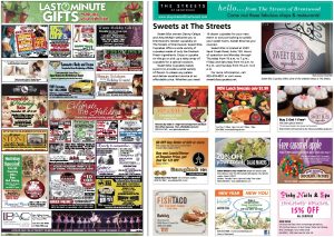
This is the tale of two ad pages — pages that have the same purpose but different approaches. And, I think, different results.
Both of these pages include several ads, all in color. Many of the ads on the page at left are overloaded with images and typography and the color is sometimes overdone.
But the real difference between the two pages is that the ads on the left page are cram-jammed together. In most cases, they’re almost touching, and where they’re not touching the spacing appears arbitrary and inconsistent.
As a result, the page is a design hodgepodge. It’s difficult for readers to tell one ad from the other. None of the ads is distinctive because they all bang into each other. For the advertiser, finding his ad is like playing “Where’s Waldo?” He has to search the page to find his ad, and he’s left to hope the reader will find it.
The page at right is a better investment for the advertiser. Yes, the ads are larger and they’ll cost him more, but they’re certainly better designed.
More important, though, is the generous space between each ad. The advertiser — and especially the reader — has no trouble seeing that his ad stands out from others around it.
The page has a clean, purposeful look about it. It appears planned — because it is planned.
I’m convinced that, given the choice, your advertiser would see buying an ad for the page on the left as an advertising cost — but an ad on the page on the right as an investment.
Cost … investment: Which do you think would be more appealing to your advertiser?
Ed Henninger is an independent newspaper consultant and director of Henninger Consulting, offering comprehensive newspaper design services including redesigns, workshops, design training and design evaluations. Visit henningerconsulting.com or email edh@henningerconsulting.com.


