Design for Readers by Ed Henniger
A man, they say, is king of his castle. That may be so, but there’s a word for the man who thinks he’s really in charge at home. “Bachelor.”
The queen rules…and it’s been that way since Adam took his bite of the apple. Some of my friends refer to their wives as “she who must be obeyed.” I get that!

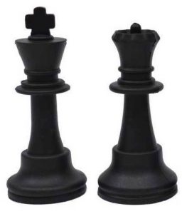
Even in chess, the queen is more powerful. The king can move in any direction, but only one space at a time. But the queen? Well, she also can move in any direction, and she can go as far as she wants.
So…who’s really more powerful? And what in the world does this have to do with news design?
The answer to the first question is simple: The queen.
Stay with me now, and I’ll tie this all in with news design.
For decades, I’ve heard the maxim: “Content is king!” It’s true. Content is king, and I’ve never disagreed with that.
But if content is king, then—at least in my book—design is queen.
It’s design that makes your content better.
It’s design that compels readers to read.
It’s design that organizes content throughout your paper.
It’s design that separates the various packages on the page, so readers can tell immediately what goes with what.
It’s design that brings a long-term sense of identity to your newspaper.
It’s design that creates interest and impact.
It’s design that adds color and creativity where those are called for.
It’s design that takes all that content—sometimes unshaven, sometimes disheveled, sometimes scruffy and straggly—and cleans it up so it can better serve readers.
All the princes and pawns know this simple fact: Content may be king. But then, the king is never at his best without the queen at his side.


